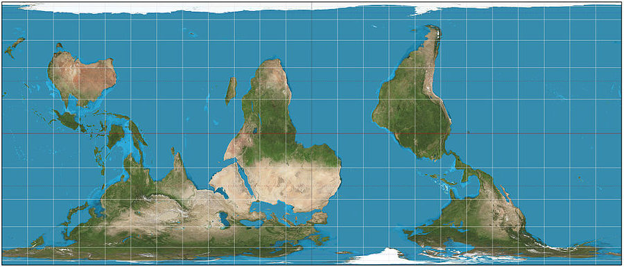
What the world looks like

If you’re like most people, you will have seen the image in this post and thought something like “Why is the world upside down?” If you’re particularly keen, you may have noticed that the countries in the extreme north are also smaller than usual. So: What am I up to?
The reason for this post is that the image is not “upside down”. There is no right-side up! It is only by convention that humanity typically puts north at the top of maps. There is no reason at all to think of it that way.
In the world’s first civilizations in the Old World, the Middle East was typically the center of the world, and then north was on the left, with the east at the top. Take, for example, the Hereford Mappa Mundi.
So I want you to see the world and try not to see it as upside down, just as differently oriented. If you’re anything like me, it looks strange and unfamiliar, even though all it is, is upside down. I think it’s important to see that the world looks different from other country’s perspectives, especially New Zealand, Australia, the south Pacific, South America, and southern Africa.
Mercator projection
The map is also a different projection. In a Mercator projection – the typical way the world map is shown on flat paper – things are distorted. It is impossible to accurately show a sphere’s surface on a two-dimensional piece of paper, or on a computer screen. The Mercator projection is famous for being inaccurate.
The Mercator projection is an attempt at converting the oblate spheroid that is the world, into a flat surface. It does this by literally projecting from the sphere onto a flat sheet. This means that things near the poles get stretched out. Imagine you had a sheet of tracing paper, and you wrapped it around a globe map of Earth. Looking through the tracing paper, you would see the world, but Greenland, Russia and Britain would all be taller than they really are.
The map I have shown above squashes the Mercator projection slightly, in an attempt to make the extreme northern and southern latitudes – near the poles, more accurate in terms of size. You might notice that, in the map above, Africa looks much larger than it usually does, and Greenland looks smaller.
Here’s the Mercator projection as a reminder:

Notice how Greenland is larger than Africa, and that Great Britain is as tall as the United States, and much larger than Spain. Both these details are horribly distorted. Great Britain is 600 miles at its tallest point. The United States is 1,582 miles at its tallest point (north to south) – nearly three times as large.
Greenland has an area of 836,330 sq miles while Africa has an area of 11.67 million sq miles or, to put it more clearly, Africa is more than 13 times the size of Greenland. Look again at the Mercator – it doesn’t look that way!
I wonder, as a way of closing out this article, whether there are other things we see continually, which we do not really see. I wonder if there are things that are so culturally indoctrinated, that we don’t notice that they’re wrong. I actually do know that that is the case, which is why I strongly encourage travel. And lots of it!

Image courtesy of Strebe available under Creative Commons license.
By Strebe – CC BY-SA 3.0