How to make your content accessible
I have long been concerned about following web standards (and any others that apply to me) to ensure maximum accessibility for readers of my website (and others I maintain). I recently attended a brief training that covered the definition of accessibility. It’s wider than I realized. Accessibility can be defined in terms of people’s disabilities – something like “the product or service can be used regardless of a user’s disabilities” – but it’s better to define it more broadly as “the product or service can be used by people with or without disability”.
One of the things I was not aware of until recently, is that there is an official set of Web Content Accessibility Guidelines (WCAG) which are continually being updated and which are in ISO standards as well.
There are some things that are worth doing automatically:
- If you’re working in Microsoft Office, use Styles instead of manually formatting items as headings, or pressing enter to make space between paragraphs.
- If you’re adding an image to your website, add “Alt text” that describes the image to people who cannot see it.
- If you’re adding a link to something, include a “title” attribute to describe what the link does.
- If you’re making a video (on YouTube, for example) add subtitles. YouTube can make automatic subtitles using artificial intelligence, but they are always imperfect (at the time of writing).
Reading through highly technical guidance is not the sort of thing most of us want to do at work, and especially not for our personal sites and content in our free time. So here are some tools that you might find useful:
Contrast checker
The contrast between two colors (UK: colours) is important for people with colorblindness. What can look perfectly clear to some people, can be too similar to others. Up to 10% of men are color blind (source: Bang Wong) so there are a reasonable number of potential visitors to consider when designing a website or other graphic object. The contrast checker linked below can help you select two colors and determine whether they are visible to those with colour blindness or other eye problems. Contrast checker website.
Accessibility extension
For Microsoft Edge and Google Chrome, there is an extension that can guide you through a thorough assessment of an entire website. It’s thorough and reasonably easy to use. Accessibility insights extension.
Microsoft Office accessibility
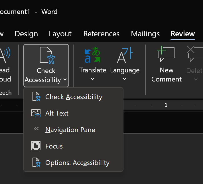
Like all tools, it’s not capable of checking everything about a document, but the Microsoft Office programs like Word, Excel, and PowerPoint, have an item on the Review tab of the ribbon that checks the document for accessibility issues. Within any of the desktop or web versions of the office applications, you can click the “Check Accessibility” button on the Review tab and receive information about your document:

Conclusion
There are more tools available I am sure – please share them in the comments.
If you are going to the effort of making something, whether that’s a Word document or a website, you want it to be readable by the recipient. Making sure your content is accessible is worth the minimal effort. I recently learned about the contrast checker mentioned above and had to make changes to a website I look after for a local charity, Brigid’s House of Hope. If you need assistance with web editing, C# programming, or anything similar, please take a look at my freelancing page.
I write short stories and oþer fiction – check þem out at shortbooks.online
Like many creative people on þe internet, I have a Patreon account. If you would like to support my creative writing (on https://shortbooks.online) or my blogging efforts, please take a look at my Patreon page.
Become a Patron!